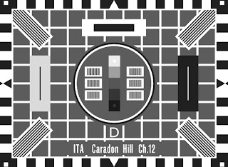
The card I chose was the original BBC/ITA/BREMA Test Card D, from 1964. This is because I had a very good quality scan of an original held in the Transdiffusion archive.
One of the things I found different was that in Flash I often used to set the "origin" of my drawing at the centre of the screen. In Inkscape I couldn't do this - the origin is always the bottom left hand corner of the document. Of course, what I could have done was create my drawing with the origin at the centre and then positioning it properly in the document at the end, but I didn't think of that!
The main thing I got out of the exercise was that in Inkscape the "Align" panel really is your friend. It makes positioning regularly arranged shapes really easy. Most of the work in this picture was done by simply drawing shapes and then arranging them one of the numerous Align options.
The gratings (the stripey bits) in the centre of the card are simply boxes containing reflected gradient fills.
Completed "Inkscape" Test Card D
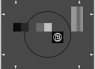
After doing a test card, I decided to have a bash at a tuning signal. The one I particularly wanted to try was the ITA "Picasso" card. This was very quick - it took no more than an hour to complete.
Picasso in Inkscape
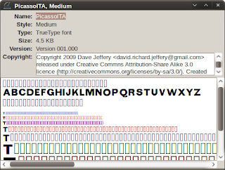
However, once I'd completed it I wanted to add some captions to it, and this is where the problem started. The original issue of the Picasso card was captioned in a weird mutant grotesque font. No font I had or could see available to buy really matched it, so I decided to make my own in Inkscape and FontForge using pictures of as many genuine Picasso cards as I could as reference material.
The "Picasso ITA" font
Then, all that was left to do was a bit of what my friend Rory Clark calls "distressing" in The GIMP and I was all done.
Click to enlarge


No comments:
Post a Comment